Our Journey in Digitalizing a Traditional Industry
Our Journey in Digitalizing a Traditional Industry
Our Journey in Digitalizing a Traditional Industry
User-Driven Innovation for a Successful Digital Transformation
User-Driven Innovation for a Successful Digital Transformation
User-Driven Innovation for a Successful Digital Transformation
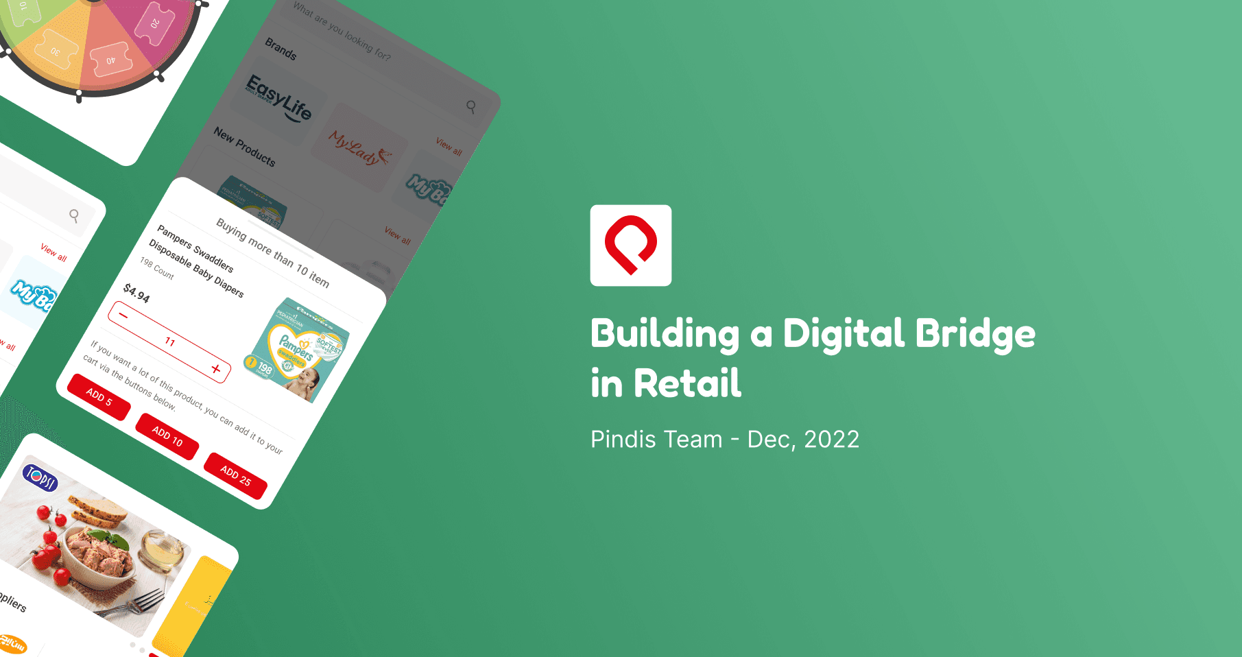


Intro: a mission impossible
Pindis was created to streamline the process of supermarkets ordering FMCG products from suppliers. The most significant challenge for Pindis was striking a balance between suppliers' demands and supermarkets' needs, which was extremely difficult due to the wide range of requirements on both sides.
For Suppliers:
We aimed to create a solution that reduces the cost of acquiring new customers and boosts sales.For Supermarkets:
We aimed to offer a reliable platform where they could find everything they need at the best price.
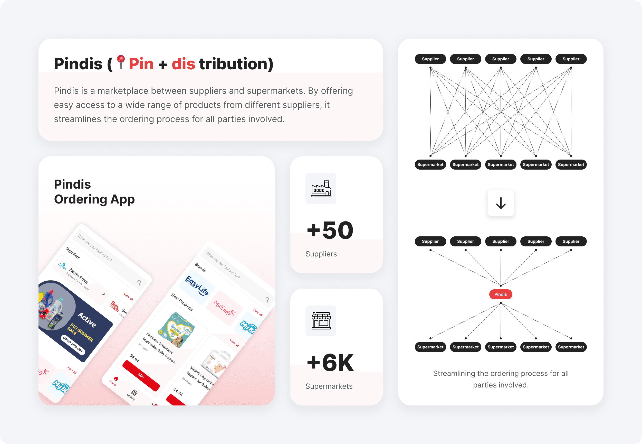
Several companies attempted to solve this problem, but none succeeded. As a result, our objective seemed like a mission impossible from the beginning.
Situation: First day of work
I joined the team as a senior product designer and was responsible for leading the design process, with Reza, who was already on the team as the product designer, and Nooshin who joined our team after a while. At that time, the MVP had just been launched and approximately 1,000 orders had been submitted, but the company was at the first stage of UX maturity (absent), with little to no focus on user needs. To advance the design maturity of the organization to the next stage:
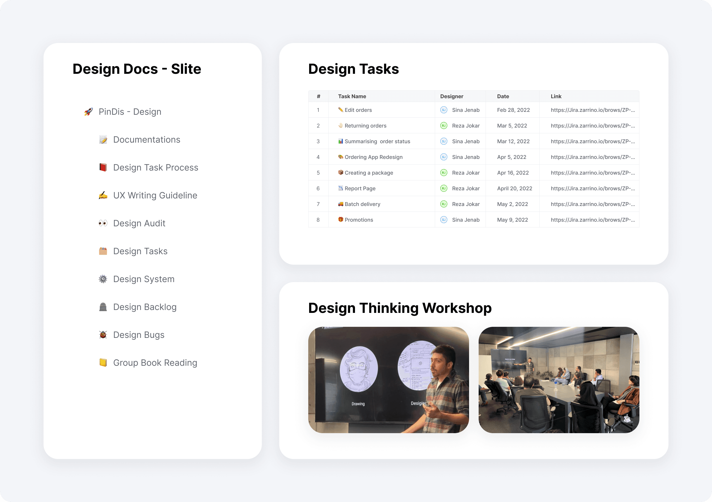
I began fostering UX awareness by conducting a design thinking workshop within the organization.
I focused on refining our internal processes by integrating user research into the design process.
I started documenting each design task and sharing the design process with the entire team.
If I had a chance to redo things, I'd probably follow a similar path, but I'd put more effort into gathering insights from our users. Reflecting on it now, I see that I devoted more attention to internal tasks like coordinating with the tech team and managing stakeholders, rather than focusing on how our users interact with our product.
Problem: It wasn't working!
We expanded our suppliers from 4 to 12 and it was a nightmare. The expansion created distinct challenges for both suppliers and supermarkets, our primary customer base.
Supplier Challenges:
Each supplier demanded a custom solution to suit their specific products, which led us to become a "feature factory" continuously developing to meet their demands. Yet, we couldn't generate meaningful sales for them.Supermarket Challenges:
Supermarkets, our primary customers, were buying only a small portion of their needs through our platform. They relied on other solutions to fulfill most of their requirements, but we didn't know why then.
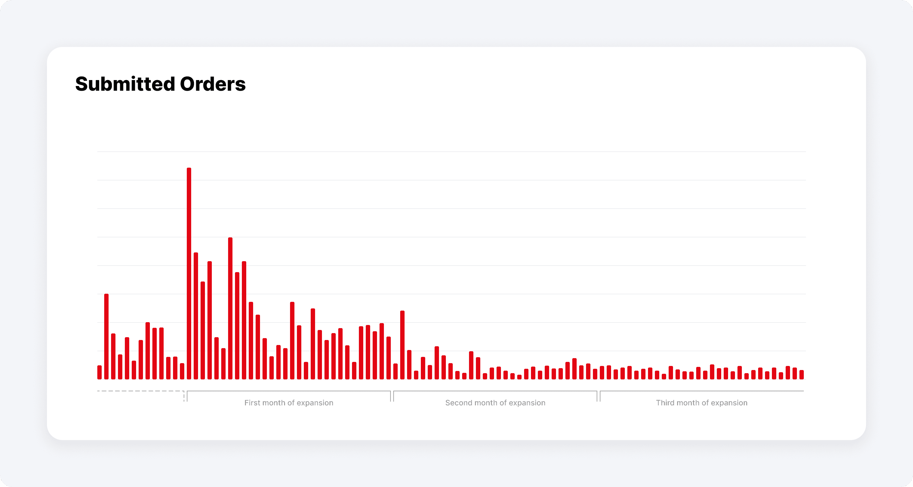
These issues led to a huge loss of motivation within our product and business teams. The uncertainty caused significant turnover, and even the board replaced the CEO, signaling a significant lack of confidence in our direction. I was determined to stay and understand the root causes of these problems, hoping to uncover valuable insights or find a way to turn things around.
Magic Potion: Getting to know the customers
The breakthrough happened when we decided to listen more intently to our customers. It was a simple yet powerful shift in strategy. With a new management team in place, I was promoted to oversee the entire design chapter in the organization. My first step was to hire a User Researcher Raha to gain deeper insights from our customers.
1- Finding the first clues
We aimed to understand how well our solution aligned with supermarket requirements. We needed this information urgently to advocate for users' needs to our new business team and to help shape the strategy based on customer pain points.
To achieve this, we decided to conduct phone interviews with users who had previously used our product but stopped after we expanded our supplier base. This approach would give us insights into what went wrong and how we could improve.
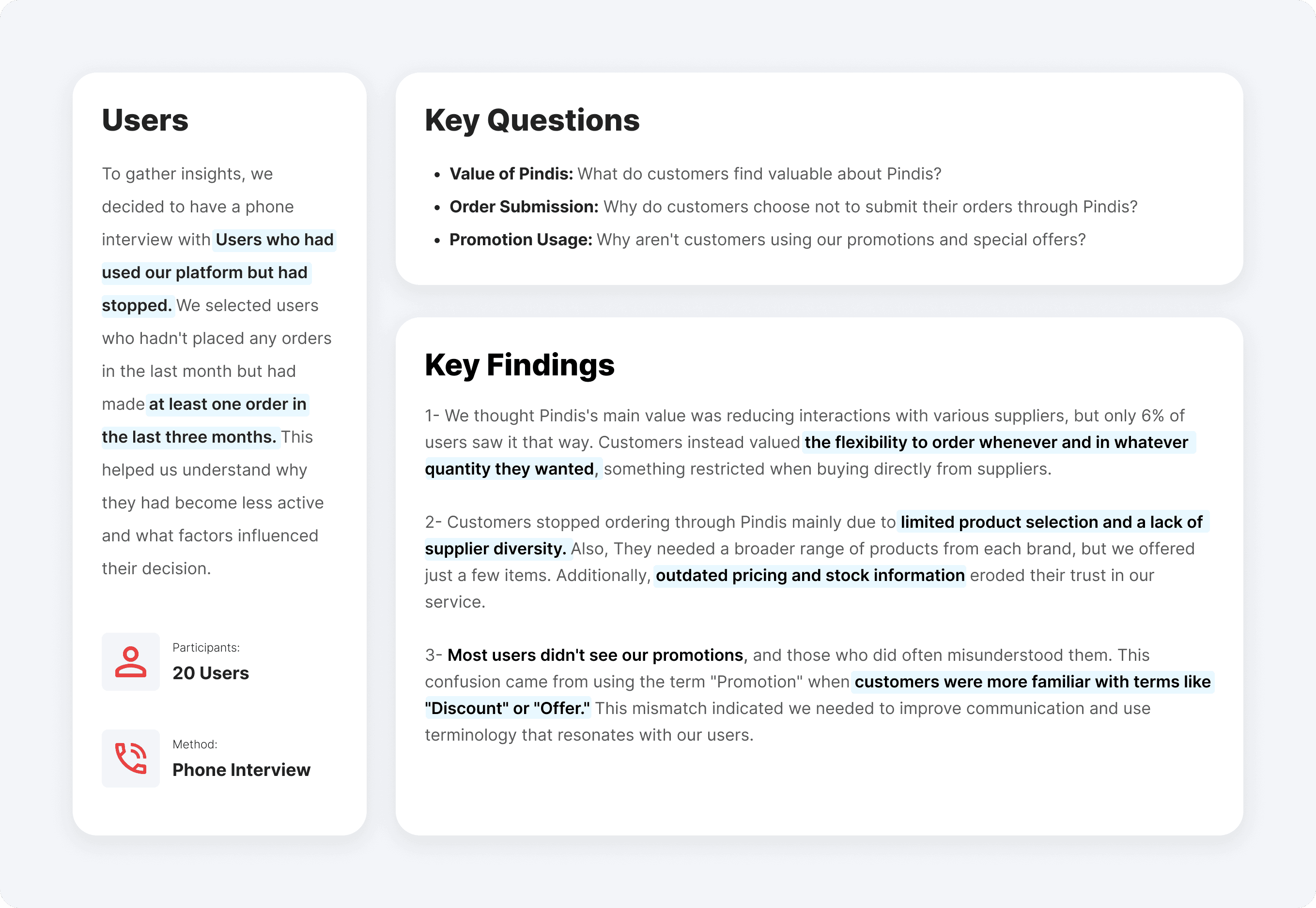
Later, we paired the findings from our customer interviews with an in-depth interview and a comprehensive survey to obtain more insights into the user experience. We then shared these results with the business team, leading to significant changes in our strategy and processes:
Marketplace to E-commerce: Users expressed the need to purchase multiple variations of a brand's products in one place. This insight led to a shift from a marketplace model to a more cohesive e-commerce strategy, allowing customers to buy from multiple suppliers without individual negotiations.
Updating the Price and Quantity: The research revealed that price and quantity data were often outdated. In response, the executive team implemented a new process to ensure pricing and stock information were accurate, enhancing the customer experience.
Lack of awareness about promotions: The research showed that many users were unaware of our promotions. This finding indicated an issue with communication or product design, prompting a renewed focus on improving our promotion and special offers.
2- Finding out more
After gathering some basic information about our customers, it was time to delve deeper into their behavior to identify their problems using Pindis. We invited five users to our office to conduct a comprehensive usability test of our product to ensure it met their expectations and was user-friendly. But one of them couldn't make it that day. Since the usability problems with the app were so obvious, we didn't invite another user for the test and decided to focus on fixing the most important problems.
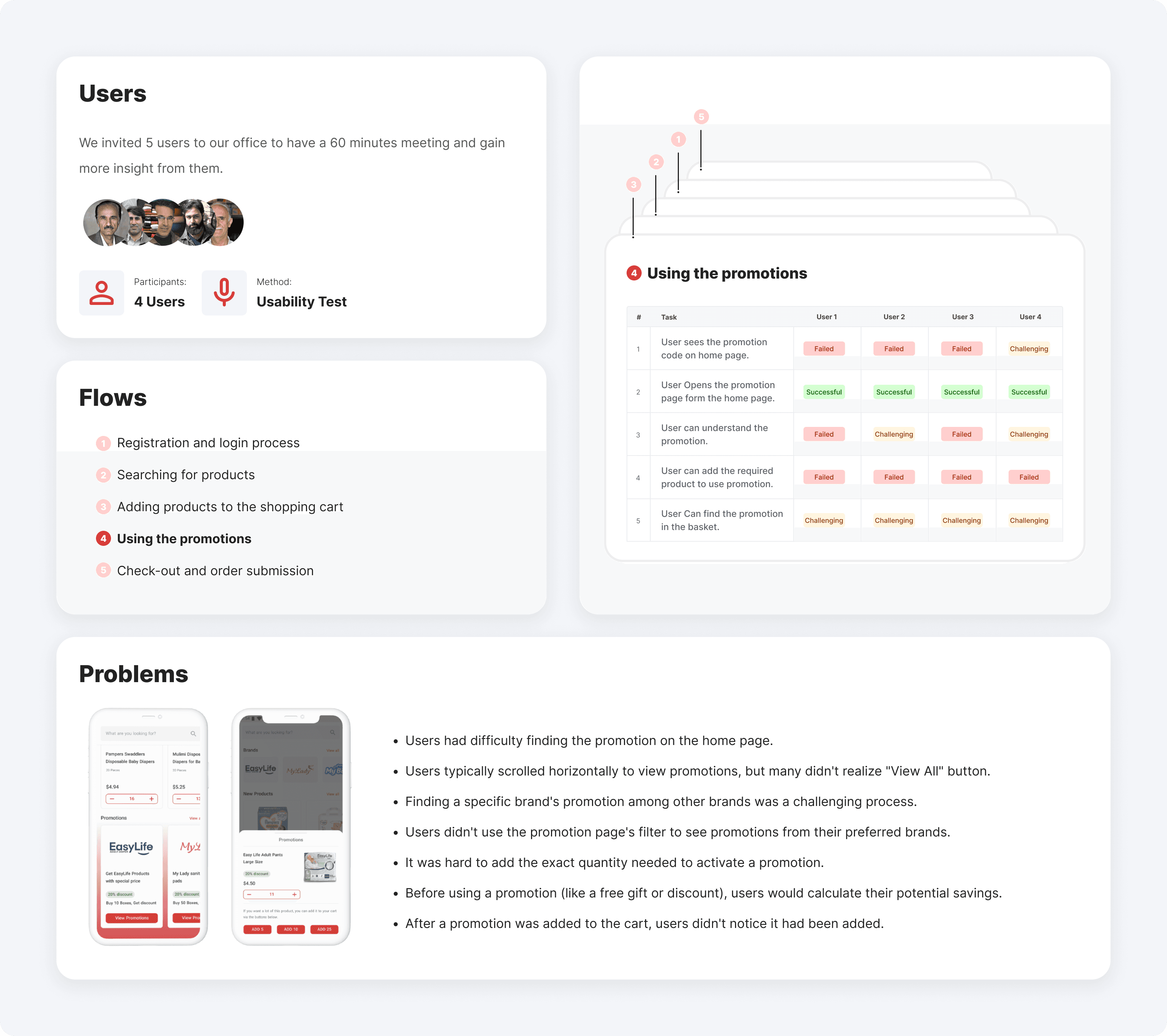
After reviewing the feedback from the usability test, I led the development of a roadmap and defined tasks for our product designers to address our issues. Such as:
In the registration form, users couldn't tell which fields were optional. This issue was very important because it would lead to withdrawal from the registration process. So, Instead of using an asterisk (*), we used the word "Optional" for optional fields.
In the registration form, when entering their address, users couldn't search on a map, So we added map search functionality to the new layout.
On the product card, Users needed the unit price and profit margin In addition to the total product price, which we added to the new design.
We completely redesigned the promotion process and since our users weren't familiar with the term "Promotion," we changed it to "Special Offer" which was more commonly understood.
3- Speaking fluently with Data
We identified a significant gap in understanding how to measure our product's quality using data. Initially, our sole metric for success was the number of orders per day. To address this limitation, I took the initiative to improve my skills in data analytics by enrolling in courses and deepening my knowledge in this field.
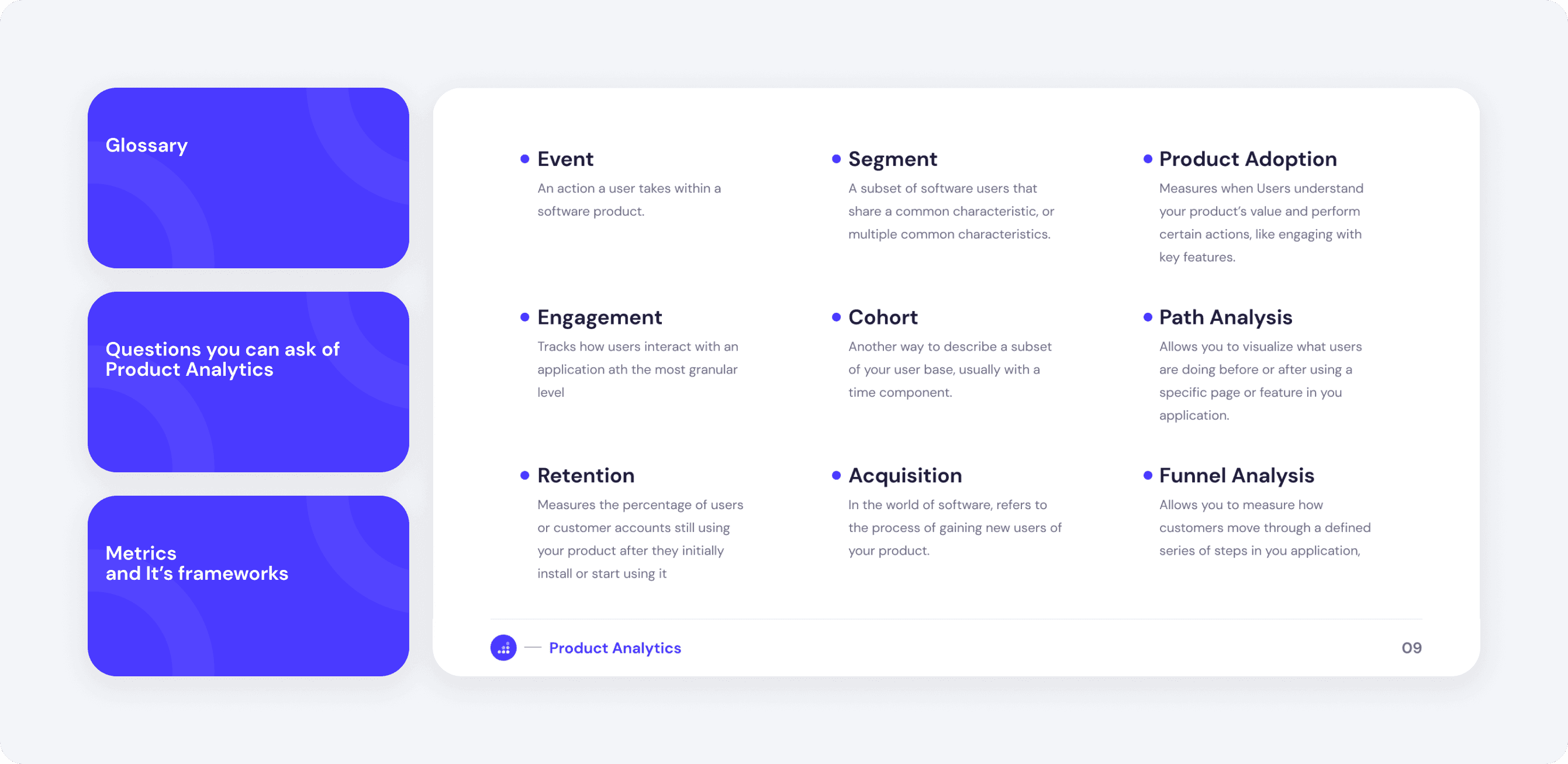
This journey expanded my understanding of key concepts such as customer retention, sales funnels, and conversion rates. To share this new knowledge with the team, I organized a meeting where I explained these analytics concepts to the other designers. You can download the full Presentation from here: Product_Analytics
As a result of my expertise in data analysis, I became the go-to person for all data-related inquiries within the team. I prepared different tables on Google Analytics to oversee the user's behavior and discover areas that we can Improve. for example:
Promotions page:
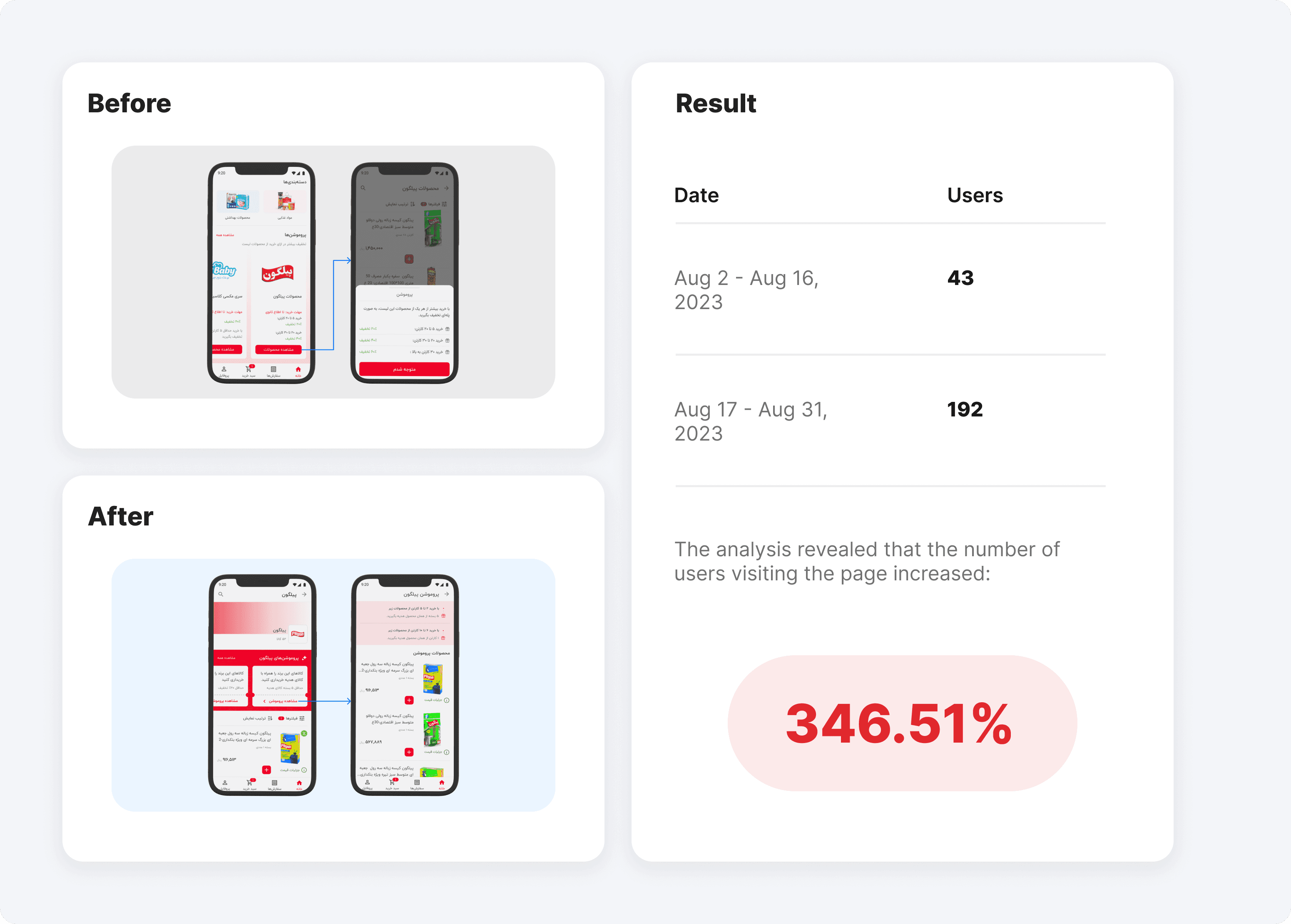
Promotions Page: From our prior analysis, we realized that the location of the promotions section wasn't user-friendly, making it difficult for our users to find it. At that time, technical constraints prevented us from tracking the actual usage of promotions. To overcome this barrier, I proposed using the second best thing which was the Promotion Page view.Upon reviewing the data, I found that only a small percentage of our daily users were reaching the Promotion Page. So, I collaborated with Nooshin to relocate the promotions section to a more accessible location. This change led to significant growth in user engagement and an increase in Promotion Page views. you can see more details on
Pindis Promotions
Brand Section:
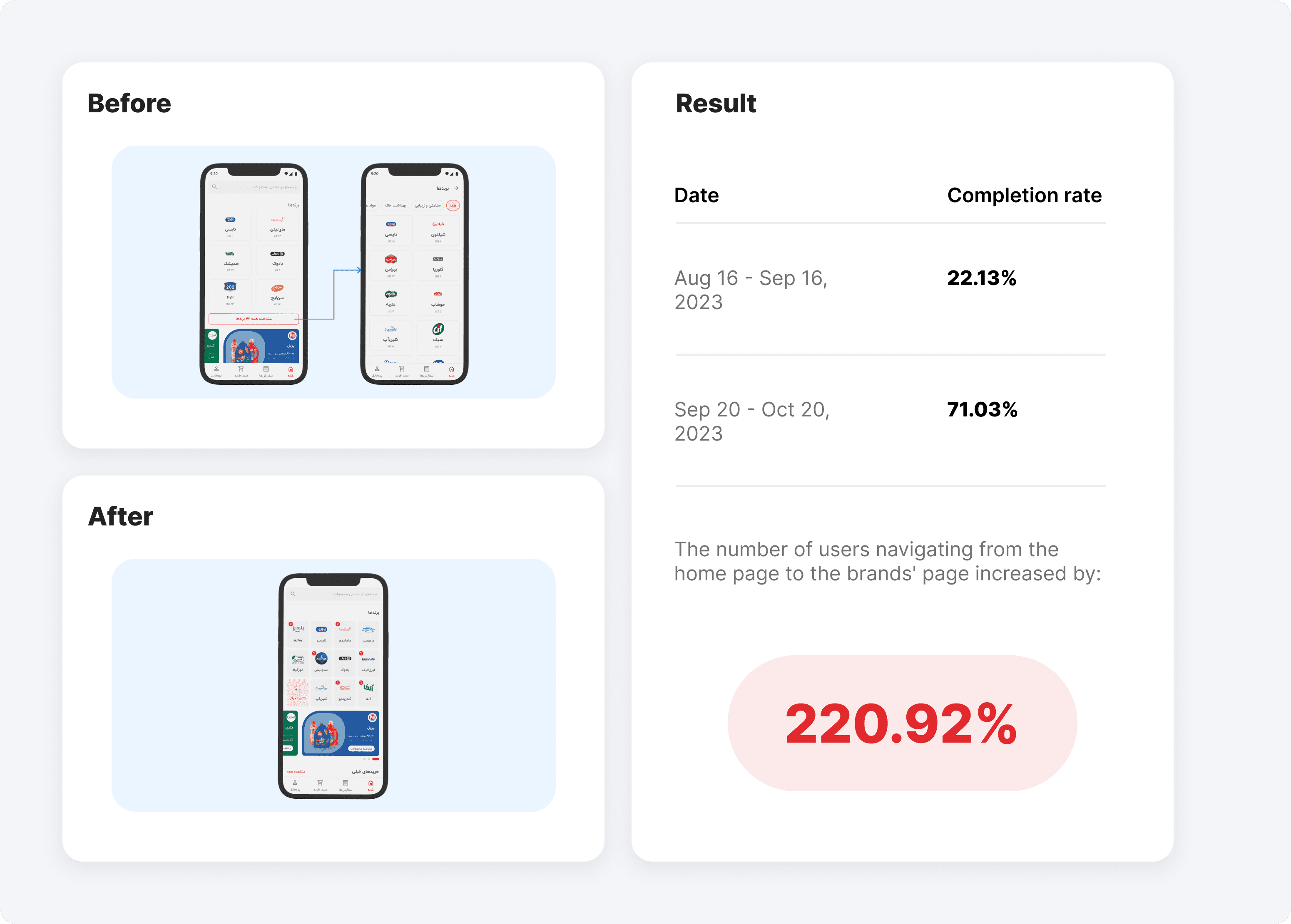
After analyzing the data, we found that users mostly placed orders from brands featured on the home page, with a significantly low number of visits to brand-specific pages. Over a one-month observation period, we discovered that only 22% of users who landed on the home page went on to visit a brand's page. Further, over 80% of this month's orders were placed with brands displayed on the home page. This highlighted a need to improve the visibility and structure of brand pages to drive more traffic and engagement.I outlined the design task for Nooshin, and through an iterative redesign process, she restructured the brand section, leading to a significant increase in the conversion rate for this page. you can see the details on her case study about the
Brand Section on PinDis
Result: Continuous delightful growth
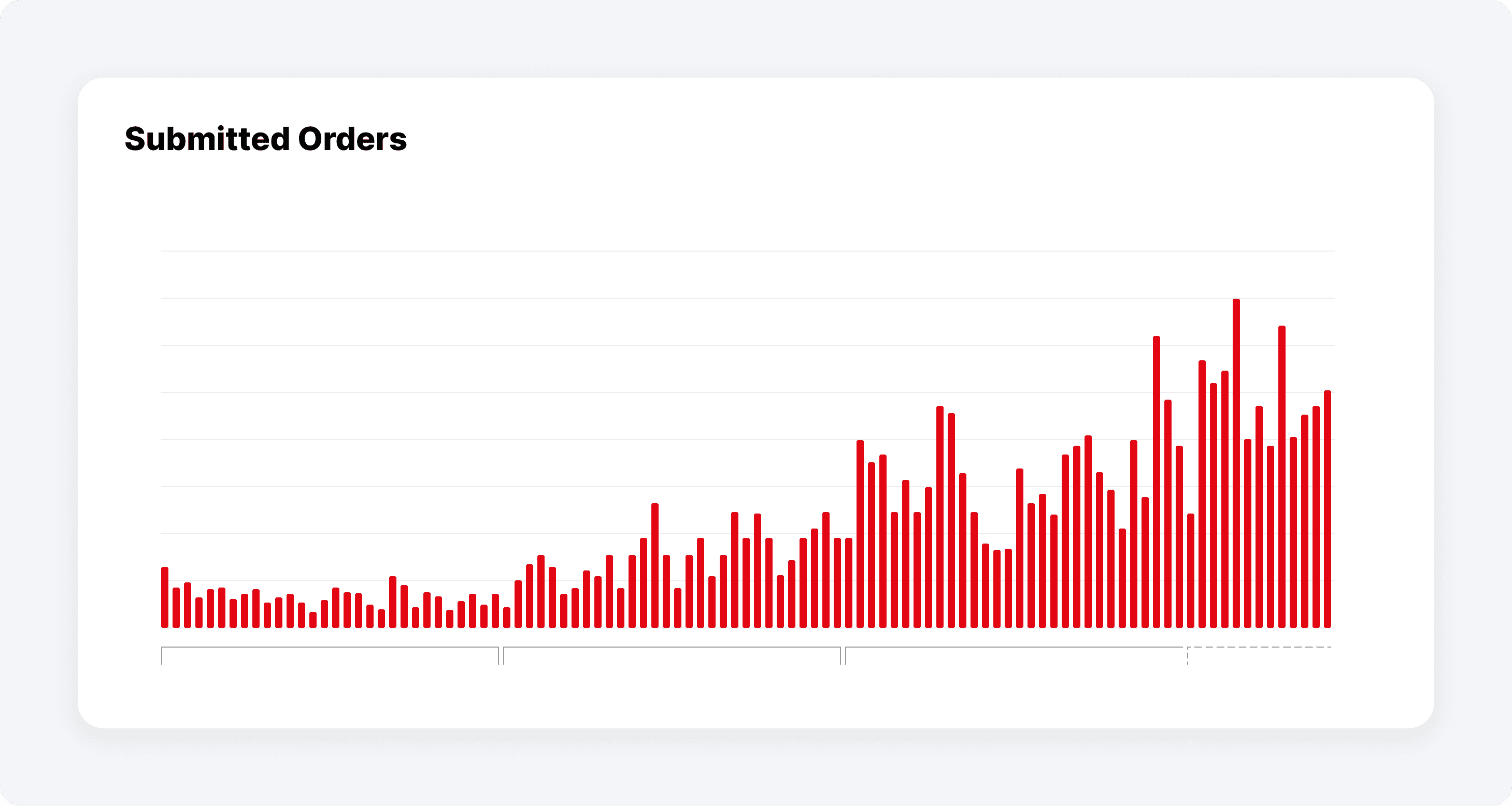
Pindis faced challenges in its journey to digitize supermarket orders due to a complex design and low user engagement. The breakthrough came when the team began listening to customer feedback, leading to significant changes in product strategy. This user-focused approach, combined with data-driven decision-making, helped Pindis improve the design of key sections like promotions and brand pages. The result was enhanced customer satisfaction and steady growth, illustrating the value of adapting to customer needs in a successful digital transformation.
As a result of our learning:
We recognize the importance of user feedback, so we held weekly interview sessions, talking to over 75 users about 12 different topics in just three months.
We leveraged data analytics, examining metrics like page views, path exploration, and search queries to improve the usability of our product.
We refined key metrics on our Metabase dashboard, and through several iterations, we significantly improved user engagement and conversion rates.
Intro: a mission impossible
Pindis was created to streamline the process of supermarkets ordering FMCG products from suppliers. The most significant challenge for Pindis was striking a balance between suppliers' demands and supermarkets' needs, which was extremely difficult due to the wide range of requirements on both sides.
For Suppliers:
We aimed to create a solution that reduces the cost of acquiring new customers and boosts sales.For Supermarkets:
We aimed to offer a reliable platform where they could find everything they need at the best price.

Several companies attempted to solve this problem, but none succeeded. As a result, our objective seemed like a mission impossible from the beginning.
Situation: First day of work
I joined the team as a senior product designer and was responsible for leading the design process, with Reza, who was already on the team as the product designer, and Nooshin who joined our team after a while. At that time, the MVP had just been launched and approximately 1,000 orders had been submitted, but the company was at the first stage of UX maturity (absent), with little to no focus on user needs. To advance the design maturity of the organization to the next stage:
I began fostering UX awareness by conducting a design thinking workshop within the organization.
I focused on refining our internal processes by integrating user research into the design process.
I started documenting each design task and sharing the design process with the entire team.

If I had a chance to redo things, I'd probably follow a similar path, but I'd put more effort into gathering insights from our users. Reflecting on it now, I see that I devoted more attention to internal tasks like coordinating with the tech team and managing stakeholders, rather than focusing on how our users interact with our product.
Problem: It wasn't working!
We expanded our suppliers from 4 to 12 and it was a nightmare. The expansion created distinct challenges for both suppliers and supermarkets, our primary customer base.
Supplier Challenges:
Each supplier demanded a custom solution to suit their specific products, which led us to become a "feature factory" continuously developing to meet their demands. Yet, we couldn't generate meaningful sales for them.Supermarket Challenges:
Supermarkets, our primary customers, were buying only a small portion of their needs through our platform. They relied on other solutions to fulfill most of their requirements, but we didn't know why then.

These issues led to a huge loss of motivation within our product and business teams. The uncertainty caused significant turnover, and even the board replaced the CEO, signaling a significant lack of confidence in our direction. I was determined to stay and understand the root causes of these problems, hoping to uncover valuable insights or find a way to turn things around.
Magic Potion: Getting to know the customers
The breakthrough happened when we decided to listen more intently to our customers. It was a simple yet powerful shift in strategy. With a new management team in place, I was promoted to oversee the entire design chapter in the organization. My first step was to hire a User Researcher Raha to gain deeper insights from our customers.
1- Finding the first clues
We aimed to understand how well our solution aligned with supermarket requirements. We needed this information urgently to advocate for users' needs to our new business team and to help shape the strategy based on customer pain points.
To achieve this, we decided to conduct phone interviews with users who had previously used our product but stopped after we expanded our supplier base. This approach would give us insights into what went wrong and how we could improve.

Later, we paired the findings from our customer interviews with an in-depth interview and a comprehensive survey to obtain more insights into the user experience. We then shared these results with the business team, leading to significant changes in our strategy and processes:
Marketplace to E-commerce: Users expressed the need to purchase multiple variations of a brand's products in one place. This insight led to a shift from a marketplace model to a more cohesive e-commerce strategy, allowing customers to buy from multiple suppliers without individual negotiations.
Updating the Price and Quantity: The research revealed that price and quantity data were often outdated. In response, the executive team implemented a new process to ensure pricing and stock information were accurate, enhancing the customer experience.
Lack of awareness about promotions: The research showed that many users were unaware of our promotions. This finding indicated an issue with communication or product design, prompting a renewed focus on improving our promotion and special offers.
2- Finding out more
After gathering some basic information about our customers, it was time to delve deeper into their behavior to identify their problems using Pindis. We invited five users to our office to conduct a comprehensive usability test of our product to ensure it met their expectations and was user-friendly. But one of them couldn't make it that day. Since the usability problems with the app were so obvious, we didn't invite another user for the test and decided to focus on fixing the most important problems.

After reviewing the feedback from the usability test, I led the development of a roadmap and defined tasks for our product designers to address our issues. Such as:
In the registration form, users couldn't tell which fields were optional. This issue was very important because it would lead to withdrawal from the registration process. So, Instead of using an asterisk (*), we used the word "Optional" for optional fields.
In the registration form, when entering their address, users couldn't search on a map, So we added map search functionality to the new layout.
On the product card, Users needed the unit price and profit margin In addition to the total product price, which we added to the new design.
We completely redesigned the promotion process and since our users weren't familiar with the term "Promotion," we changed it to "Special Offer" which was more commonly understood.
3- Speaking fluently with Data
We identified a significant gap in understanding how to measure our product's quality using data. Initially, our sole metric for success was the number of orders per day. To address this limitation, I took the initiative to improve my skills in data analytics by enrolling in courses and deepening my knowledge in this field.
This journey expanded my understanding of key concepts such as customer retention, sales funnels, and conversion rates. To share this new knowledge with the team, I organized a meeting where I explained these analytics concepts to the other designers. You can download the full Presentation from here: Product_Analytics

As a result of my expertise in data analysis, I became the go-to person for all data-related inquiries within the team. I prepared different tables on Google Analytics to oversee the user's behavior and discover areas that we can Improve. for example:
Promotions page:
Promotions Page: From our prior analysis, we realized that the location of the promotions section wasn't user-friendly, making it difficult for our users to find it. At that time, technical constraints prevented us from tracking the actual usage of promotions. To overcome this barrier, I proposed using the second best thing which was the Promotion Page view.Upon reviewing the data, I found that only a small percentage of our daily users were reaching the Promotion Page. So, I collaborated with Nooshin to relocate the promotions section to a more accessible location. This change led to significant growth in user engagement and an increase in Promotion Page views. you can see more details on
Pindis Promotions

Brand Section:
After analyzing the data, we found that users mostly placed orders from brands featured on the home page, with a significantly low number of visits to brand-specific pages. Over a one-month observation period, we discovered that only 22% of users who landed on the home page went on to visit a brand's page. Further, over 80% of this month's orders were placed with brands displayed on the home page. This highlighted a need to improve the visibility and structure of brand pages to drive more traffic and engagement.I outlined the design task for Nooshin, and through an iterative redesign process, she restructured the brand section, leading to a significant increase in the conversion rate for this page. you can see the details on her case study about the
Brand Section on PinDis

Result: Continuous delightful growth
Pindis faced challenges in its journey to digitize supermarket orders due to a complex design and low user engagement. The breakthrough came when the team began listening to customer feedback, leading to significant changes in product strategy. This user-focused approach, combined with data-driven decision-making, helped Pindis improve the design of key sections like promotions and brand pages. The result was enhanced customer satisfaction and steady growth, illustrating the value of adapting to customer needs in a successful digital transformation.

As a result of our learning:
We recognize the importance of user feedback, so we held weekly interview sessions, talking to over 75 users about 12 different topics in just three months.
We leveraged data analytics, examining metrics like page views, path exploration, and search queries to improve the usability of our product.
We refined key metrics on our Metabase dashboard, and through several iterations, we significantly improved user engagement and conversion rates.
Intro: a mission impossible
Pindis was created to streamline the process of supermarkets ordering FMCG products from suppliers. The most significant challenge for Pindis was striking a balance between suppliers' demands and supermarkets' needs, which was extremely difficult due to the wide range of requirements on both sides.
For Suppliers:
We aimed to create a solution that reduces the cost of acquiring new customers and boosts sales.For Supermarkets:
We aimed to offer a reliable platform where they could find everything they need at the best price.

Several companies attempted to solve this problem, but none succeeded. As a result, our objective seemed like a mission impossible from the beginning.
Situation: First day of work
I joined the team as a senior product designer and was responsible for leading the design process, with Reza, who was already on the team as the product designer, and Nooshin who joined our team after a while. At that time, the MVP had just been launched and approximately 1,000 orders had been submitted, but the company was at the first stage of UX maturity (absent), with little to no focus on user needs. To advance the design maturity of the organization to the next stage:
I began fostering UX awareness by conducting a design thinking workshop within the organization.
I focused on refining our internal processes by integrating user research into the design process.
I started documenting each design task and sharing the design process with the entire team.

If I had a chance to redo things, I'd probably follow a similar path, but I'd put more effort into gathering insights from our users. Reflecting on it now, I see that I devoted more attention to internal tasks like coordinating with the tech team and managing stakeholders, rather than focusing on how our users interact with our product.
Problem: It wasn't working!
We expanded our suppliers from 4 to 12 and it was a nightmare. The expansion created distinct challenges for both suppliers and supermarkets, our primary customer base.
Supplier Challenges:
Each supplier demanded a custom solution to suit their specific products, which led us to become a "feature factory" continuously developing to meet their demands. Yet, we couldn't generate meaningful sales for them.Supermarket Challenges:
Supermarkets, our primary customers, were buying only a small portion of their needs through our platform. They relied on other solutions to fulfill most of their requirements, but we didn't know why then.

These issues led to a huge loss of motivation within our product and business teams. The uncertainty caused significant turnover, and even the board replaced the CEO, signaling a significant lack of confidence in our direction. I was determined to stay and understand the root causes of these problems, hoping to uncover valuable insights or find a way to turn things around.
Magic Potion: Getting to know the customers
The breakthrough happened when we decided to listen more intently to our customers. It was a simple yet powerful shift in strategy. With a new management team in place, I was promoted to oversee the entire design chapter in the organization. My first step was to hire a User Researcher Raha to gain deeper insights from our customers.
1- Finding the first clues
We aimed to understand how well our solution aligned with supermarket requirements. We needed this information urgently to advocate for users' needs to our new business team and to help shape the strategy based on customer pain points.
To achieve this, we decided to conduct phone interviews with users who had previously used our product but stopped after we expanded our supplier base. This approach would give us insights into what went wrong and how we could improve.

Later, we paired the findings from our customer interviews with an in-depth interview and a comprehensive survey to obtain more insights into the user experience. We then shared these results with the business team, leading to significant changes in our strategy and processes:
Marketplace to E-commerce: Users expressed the need to purchase multiple variations of a brand's products in one place. This insight led to a shift from a marketplace model to a more cohesive e-commerce strategy, allowing customers to buy from multiple suppliers without individual negotiations.
Updating the Price and Quantity: The research revealed that price and quantity data were often outdated. In response, the executive team implemented a new process to ensure pricing and stock information were accurate, enhancing the customer experience.
Lack of awareness about promotions: The research showed that many users were unaware of our promotions. This finding indicated an issue with communication or product design, prompting a renewed focus on improving our promotion and special offers.
2- Finding out more
After gathering some basic information about our customers, it was time to delve deeper into their behavior to identify their problems using Pindis. We invited five users to our office to conduct a comprehensive usability test of our product to ensure it met their expectations and was user-friendly. But one of them couldn't make it that day. Since the usability problems with the app were so obvious, we didn't invite another user for the test and decided to focus on fixing the most important problems.

After reviewing the feedback from the usability test, I led the development of a roadmap and defined tasks for our product designers to address our issues. Such as:
In the registration form, users couldn't tell which fields were optional. This issue was very important because it would lead to withdrawal from the registration process. So, Instead of using an asterisk (*), we used the word "Optional" for optional fields.
In the registration form, when entering their address, users couldn't search on a map, So we added map search functionality to the new layout.
On the product card, Users needed the unit price and profit margin In addition to the total product price, which we added to the new design.
We completely redesigned the promotion process and since our users weren't familiar with the term "Promotion," we changed it to "Special Offer" which was more commonly understood.
3- Speaking fluently with Data
We identified a significant gap in understanding how to measure our product's quality using data. Initially, our sole metric for success was the number of orders per day. To address this limitation, I took the initiative to improve my skills in data analytics by enrolling in courses and deepening my knowledge in this field.
This journey expanded my understanding of key concepts such as customer retention, sales funnels, and conversion rates. To share this new knowledge with the team, I organized a meeting where I explained these analytics concepts to the other designers. You can download the full Presentation from here: Product_Analytics

As a result of my expertise in data analysis, I became the go-to person for all data-related inquiries within the team. I prepared different tables on Google Analytics to oversee the user's behavior and discover areas that we can Improve. for example:
Promotions page:
Promotions Page: From our prior analysis, we realized that the location of the promotions section wasn't user-friendly, making it difficult for our users to find it. At that time, technical constraints prevented us from tracking the actual usage of promotions. To overcome this barrier, I proposed using the second best thing which was the Promotion Page view.Upon reviewing the data, I found that only a small percentage of our daily users were reaching the Promotion Page. So, I collaborated with Nooshin to relocate the promotions section to a more accessible location. This change led to significant growth in user engagement and an increase in Promotion Page views. you can see more details on
Pindis Promotions

Brand Section:
After analyzing the data, we found that users mostly placed orders from brands featured on the home page, with a significantly low number of visits to brand-specific pages. Over a one-month observation period, we discovered that only 22% of users who landed on the home page went on to visit a brand's page. Further, over 80% of this month's orders were placed with brands displayed on the home page. This highlighted a need to improve the visibility and structure of brand pages to drive more traffic and engagement.I outlined the design task for Nooshin, and through an iterative redesign process, she restructured the brand section, leading to a significant increase in the conversion rate for this page. you can see the details on her case study about the
Brand Section on PinDis

Result: Continuous delightful growth
Pindis faced challenges in its journey to digitize supermarket orders due to a complex design and low user engagement. The breakthrough came when the team began listening to customer feedback, leading to significant changes in product strategy. This user-focused approach, combined with data-driven decision-making, helped Pindis improve the design of key sections like promotions and brand pages. The result was enhanced customer satisfaction and steady growth, illustrating the value of adapting to customer needs in a successful digital transformation.

As a result of our learning:
We recognize the importance of user feedback, so we held weekly interview sessions, talking to over 75 users about 12 different topics in just three months.
We leveraged data analytics, examining metrics like page views, path exploration, and search queries to improve the usability of our product.
We refined key metrics on our Metabase dashboard, and through several iterations, we significantly improved user engagement and conversion rates.
