How we used sprints to redesign our checkout
How we used sprints to redesign our checkout
How we used sprints to redesign our checkout
Suppose that you want to provide a user-friendly solution for a new feature on…
Suppose that you want to provide a user-friendly solution for a new feature on…
Suppose that you want to provide a user-friendly solution for a new feature on…
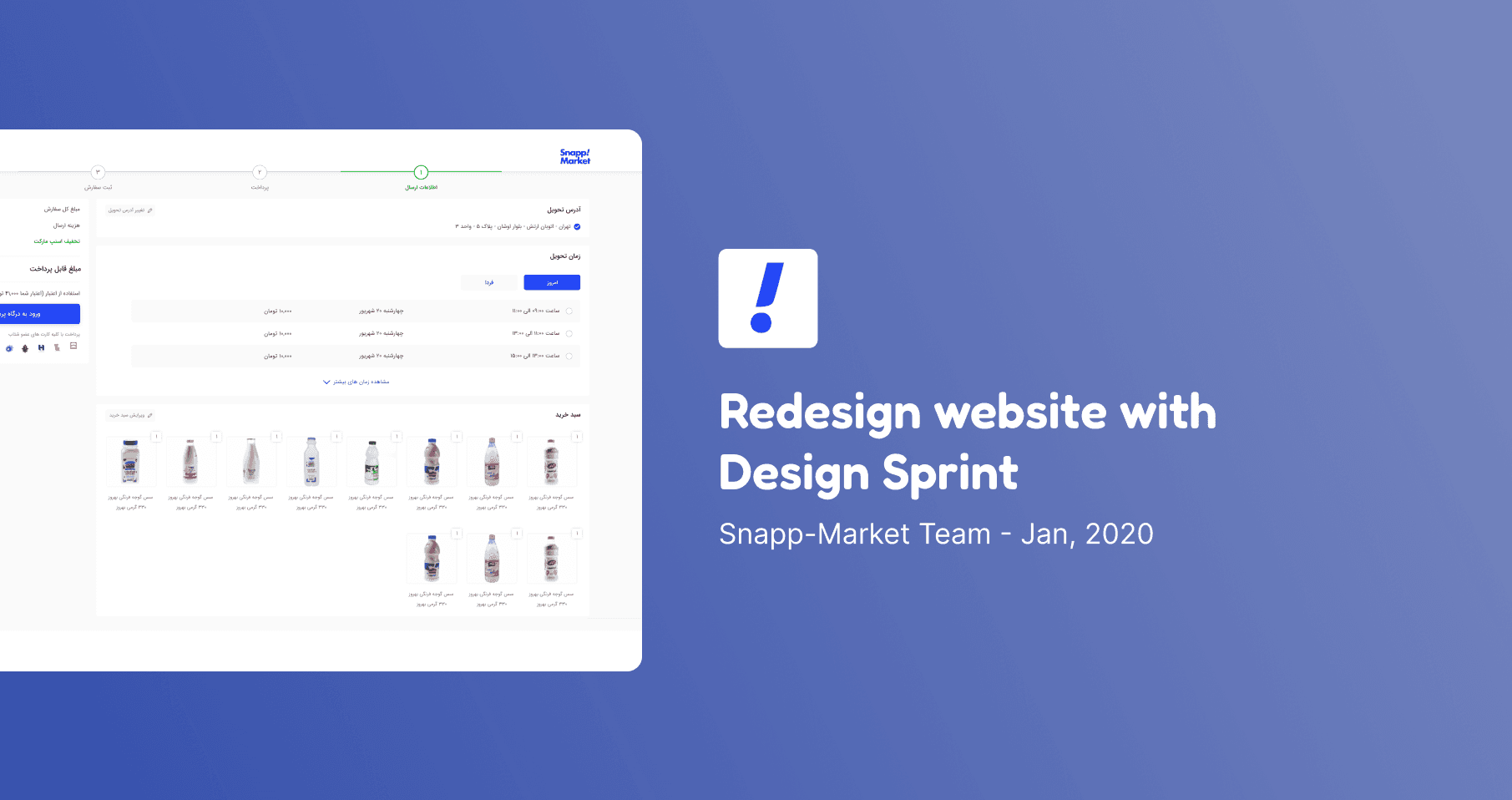


Suppose that you want to provide a user-friendly solution for a new feature on the website or application that you are working on. You spend a couple of days exploring possible solutions and choosing the best one. Then it takes a few days to prepare the designs. After several weeks of work by developers, that feature can finally go live and users can use it.
Now, if the analytics show that you have not been able to make the process easier for your users, you must discard the entire team’s hard work and start this process again. But with Design Sprint you can summarize this long process in just 5 days and you can quickly find the outcome.
Redesign the checkout page
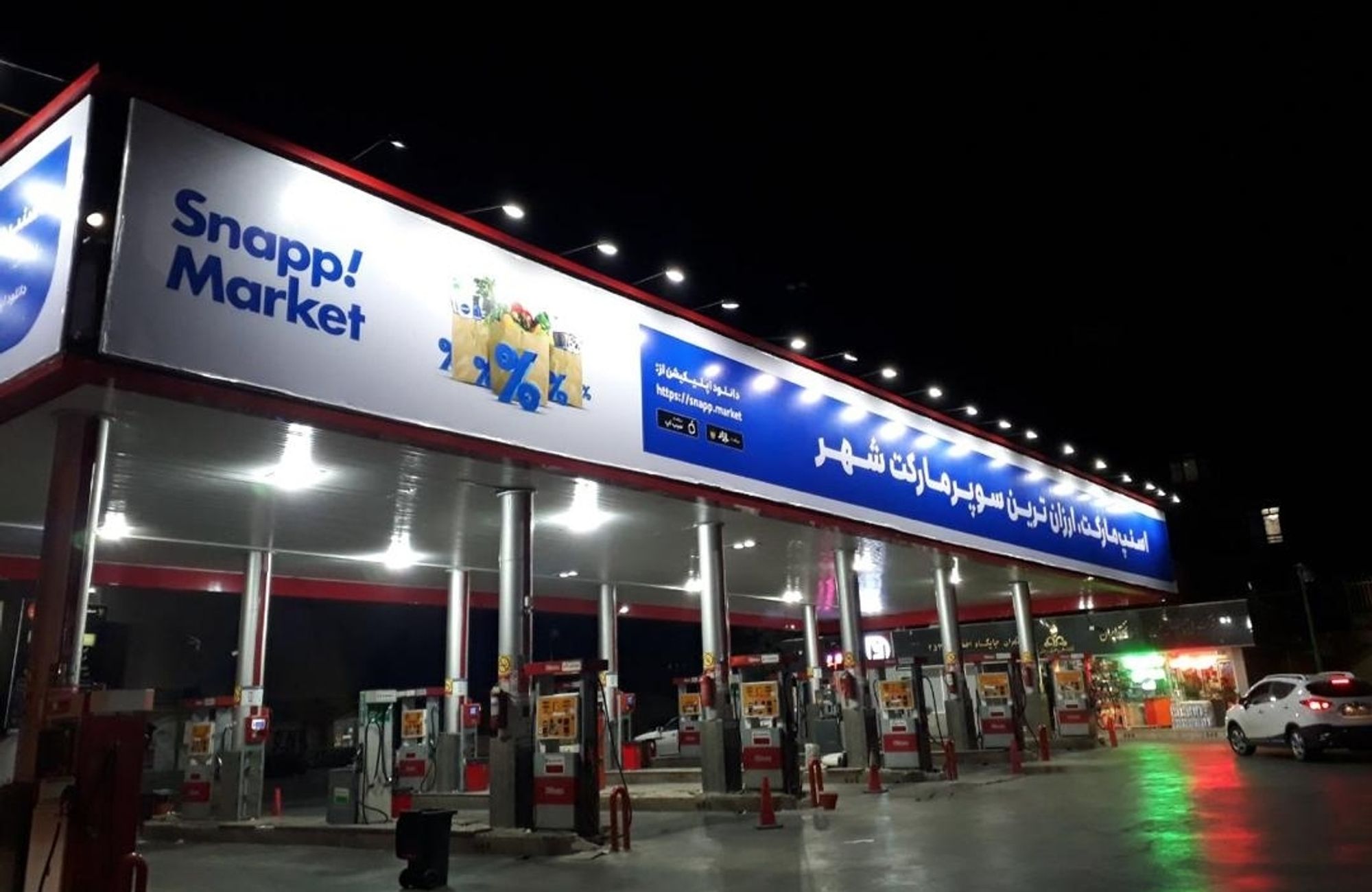
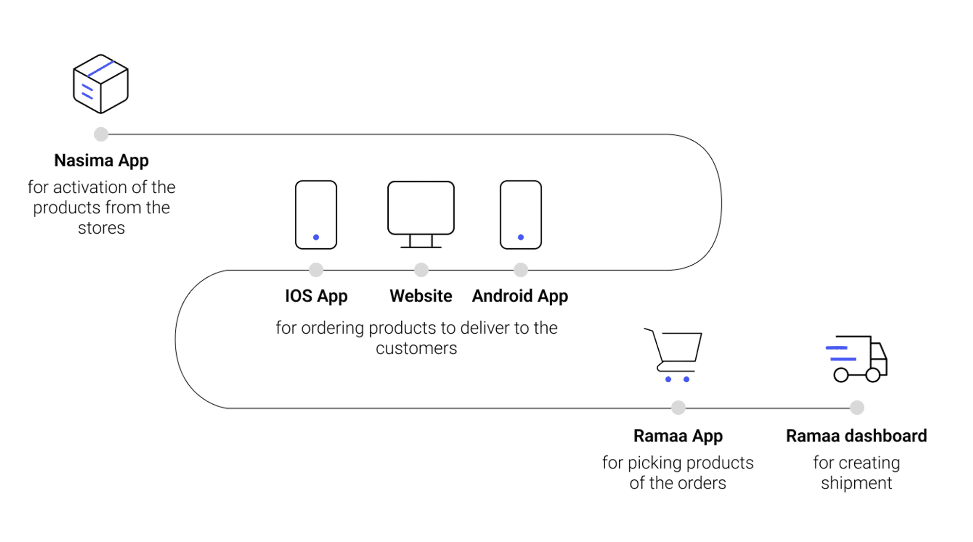
Snapp Market is the biggest online grocery shopping platform in Iran with over 1 million active monthly users. At Snapp-Market, I was the only designer on the team and I worked on 6 different products with different stakeholders. We had decided to redesign the website and improve its user experience in Snapp Market and we started our work with the most important page, the checkout page.
If you are familiar with e-commerce websites, you already know that the user experience on the checkout page is the most important part of turning users into customers. This is where the customers pay the money and the marketing and content team’s efforts bear fruit.
Before starting the design sprint, we prepared a detailed information about our customers (buyer persona). Then, by conducting usability tests, we found the most important problems of each part of the website. After that, we focused on each process in detail and started Design Sprint to redesign the check-out page.
Step One: Understanding the user needs and find the most important issue
In this step, you need to know the purpose of the user and his or her needs. You need to know how the user feels about this part of the website. Is there any doubt? Need more information? What is the one thing he does at this point? What stops the user from reaching his goal?
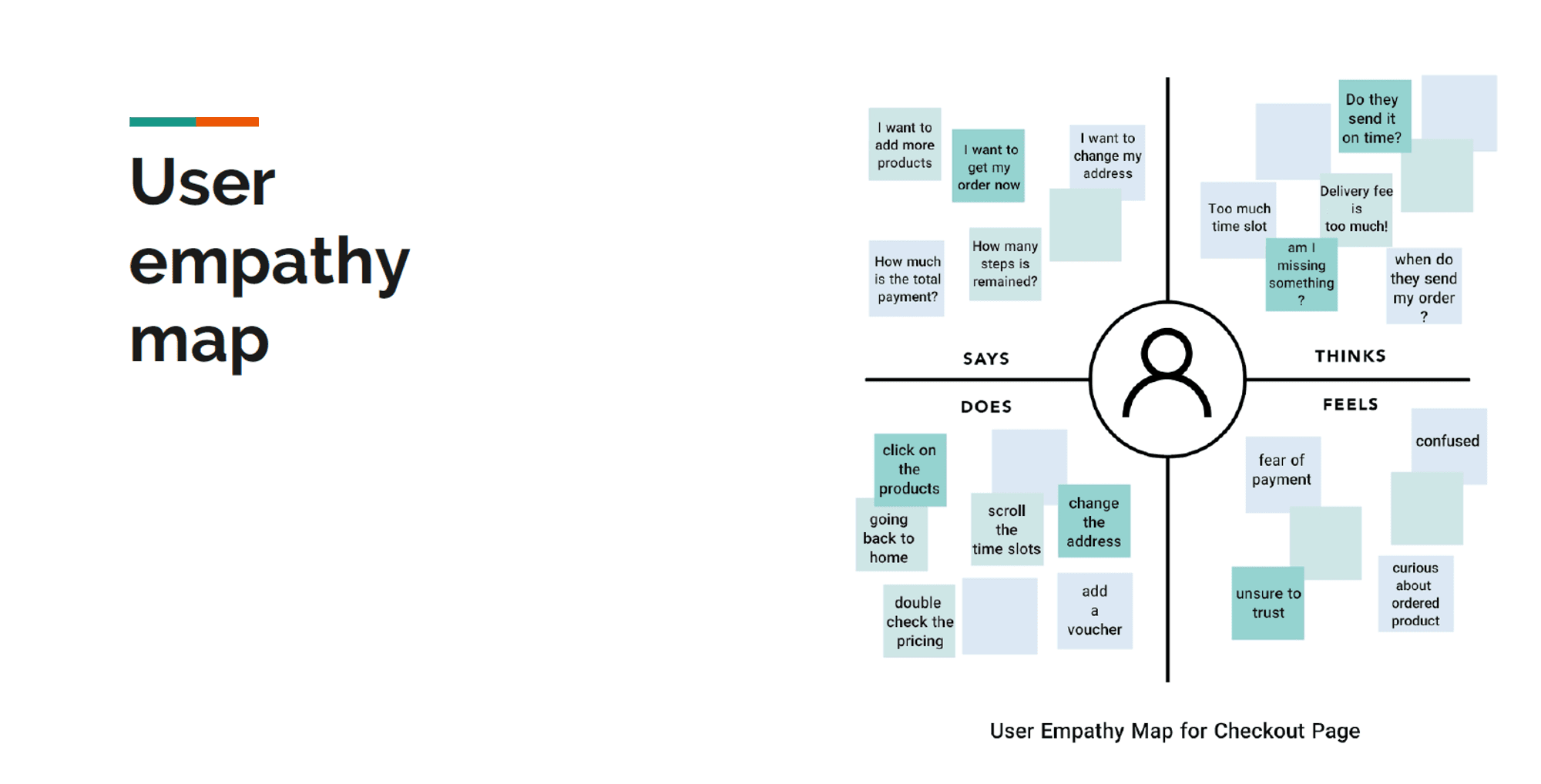
We used the results of our useability tests to create a user empathy map. We carefully monitored the behavior of our users from the videos that we had collected from our usability tests and analyzed their experience with the checkout page:
What do they do?
What are they saying?
What do they think?
How do they feel?
Having this information gave us a good understanding of the users’ behavior and made it possible for us to make good decisions quickly.
Step Two: Providing different solutions to the most important issue
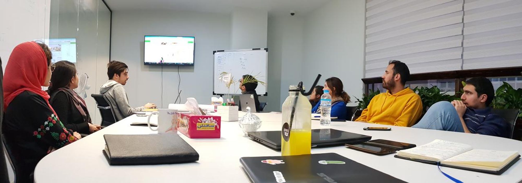
This was where we all put our ideas on paper. After getting to know the user needs, reviewing the current page design, and skimming other checkout pages from similar businesses around the world, everyone was given a marker and a big paper to bring their suggested solution on the paper and explain it. At this point, we collect many different ideas and solutions and it gives us the opportunity to think outside of the usual structure.
Step Three: Summing up the ideas and choosing the best solution
Hearing the different solutions and watching the different sketches, we found some interesting ideas that everyone liked. We agreed on these ideas by voting and giving points to different parts of each Sketch, and ultimately we found a specific concept that all people agreed to implement. Taking part of various people in the sprint, such as product manager, product designer, developers, and even CEO, at this step helped us to discuss all sides of the product and reach a common ground.
Step 4: Creating Prototype for the solution
So far, we are familiar with the user and explored his needs. We talked about different solutions and agreed to choose the best solution. Now it’s time to create a prototype for testing it.
In just a day, we transformed the sketches into a prototype that could work and it was fully simulating our new check-out process. (including address selection, delivery time selection, etc.)
Step Five: Testing the solution with real users
This may be the most exciting part of the process. At this point, you can see the result of your decisions and it shows whether you have been successful or not.
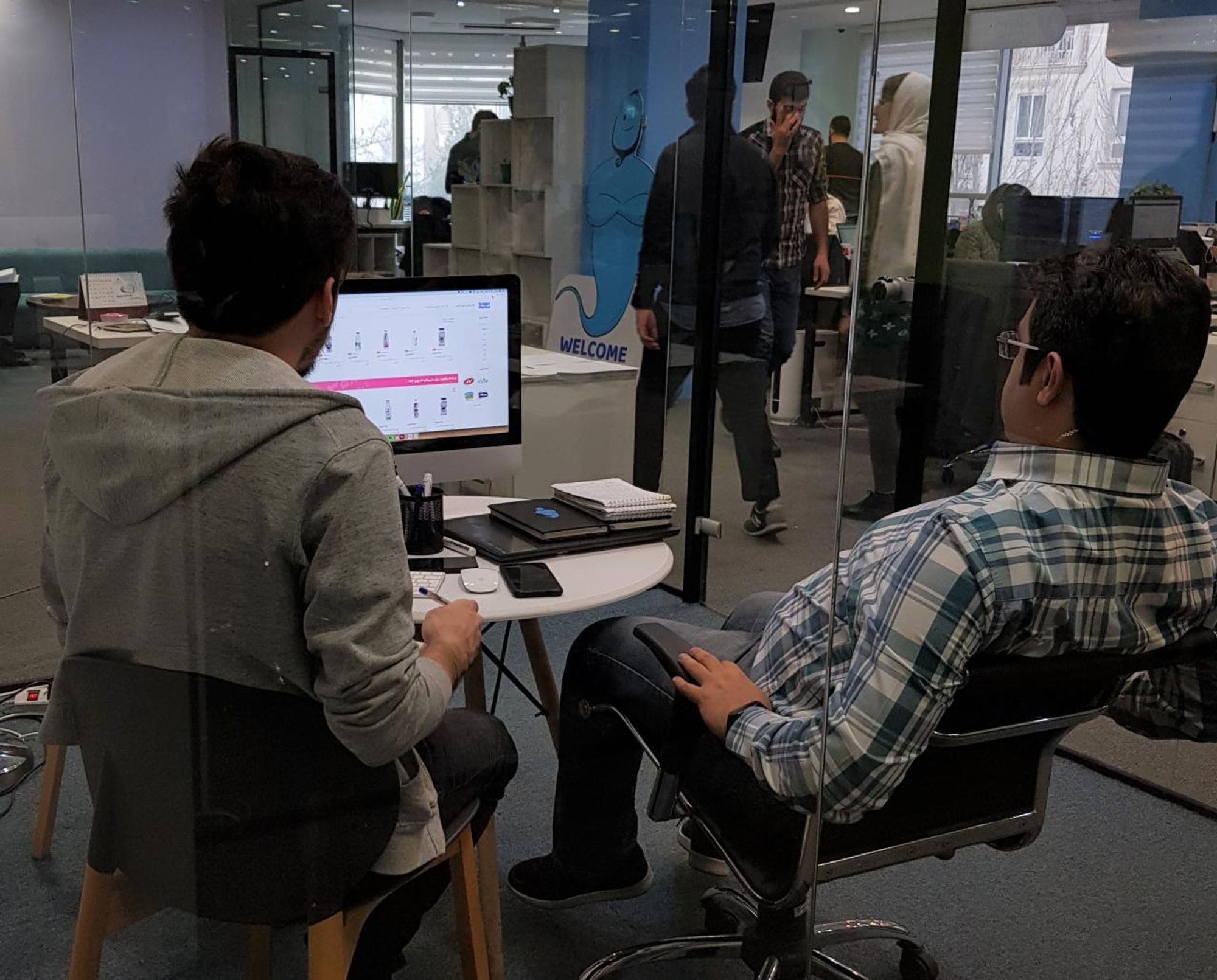
We shared the prototype with eight people to see how they engage with the new check-out page. Our scenario was, “You have added these items to your shopping cart. Now go to the checkout page and finalize your purchase” Then we carefully observed their behavior.
As we expected, the new process was more user-friendly. But there were a couple of confusing things for most users. For example, we decided that on this page users see a preview with a certain number of purchased products and scroll horizontally to see the rest of the products. But we found that the users like to see all of their items at a glance.
On the other hand, the way that we displayed the number of each item, made users think they could click on it and change the numbers.
After doing this user test, we fixed the remaining problems and it was then that we could say the design is ready to be developed.
As you can see by running a Design Sprint, the simplest problems that may confuse users can be clearly seen and we can find a solid solution to any problem. Most importantly, all of these steps occur in just 5 business days and we can save weeks and months of work on the team.
Suppose that you want to provide a user-friendly solution for a new feature on the website or application that you are working on. You spend a couple of days exploring possible solutions and choosing the best one. Then it takes a few days to prepare the designs. After several weeks of work by developers, that feature can finally go live and users can use it.
Now, if the analytics show that you have not been able to make the process easier for your users, you must discard the entire team’s hard work and start this process again. But with Design Sprint you can summarize this long process in just 5 days and you can quickly find the outcome.

Redesign the checkout page
Snapp Market is the biggest online grocery shopping platform in Iran with over 1 million active monthly users. At Snapp-Market, I was the only designer on the team and I worked on 6 different products with different stakeholders. We had decided to redesign the website and improve its user experience in Snapp Market and we started our work with the most important page, the checkout page.

If you are familiar with e-commerce websites, you already know that the user experience on the checkout page is the most important part of turning users into customers. This is where the customers pay the money and the marketing and content team’s efforts bear fruit.
Before starting the design sprint, we prepared a detailed information about our customers (buyer persona). Then, by conducting usability tests, we found the most important problems of each part of the website. After that, we focused on each process in detail and started Design Sprint to redesign the check-out page.
Step One: Understanding the user needs and find the most important issue
In this step, you need to know the purpose of the user and his or her needs. You need to know how the user feels about this part of the website. Is there any doubt? Need more information? What is the one thing he does at this point? What stops the user from reaching his goal?

We used the results of our useability tests to create a user empathy map. We carefully monitored the behavior of our users from the videos that we had collected from our usability tests and analyzed their experience with the checkout page:
What do they do?
What are they saying?
What do they think?
How do they feel?
Having this information gave us a good understanding of the users’ behavior and made it possible for us to make good decisions quickly.
Step Two: Providing different solutions to the most important issue

This was where we all put our ideas on paper. After getting to know the user needs, reviewing the current page design, and skimming other checkout pages from similar businesses around the world, everyone was given a marker and a big paper to bring their suggested solution on the paper and explain it. At this point, we collect many different ideas and solutions and it gives us the opportunity to think outside of the usual structure.
Step Three: Summing up the ideas and choosing the best solution
Hearing the different solutions and watching the different sketches, we found some interesting ideas that everyone liked. We agreed on these ideas by voting and giving points to different parts of each Sketch, and ultimately we found a specific concept that all people agreed to implement. Taking part of various people in the sprint, such as product manager, product designer, developers, and even CEO, at this step helped us to discuss all sides of the product and reach a common ground.
Step 4: Creating Prototype for the solution
So far, we are familiar with the user and explored his needs. We talked about different solutions and agreed to choose the best solution. Now it’s time to create a prototype for testing it.
In just a day, we transformed the sketches into a prototype that could work and it was fully simulating our new check-out process. (including address selection, delivery time selection, etc.)
Step Five: Testing the solution with real users
This may be the most exciting part of the process. At this point, you can see the result of your decisions and it shows whether you have been successful or not.

We shared the prototype with eight people to see how they engage with the new check-out page. Our scenario was, “You have added these items to your shopping cart. Now go to the checkout page and finalize your purchase” Then we carefully observed their behavior.
As we expected, the new process was more user-friendly. But there were a couple of confusing things for most users. For example, we decided that on this page users see a preview with a certain number of purchased products and scroll horizontally to see the rest of the products. But we found that the users like to see all of their items at a glance.
On the other hand, the way that we displayed the number of each item, made users think they could click on it and change the numbers.
After doing this user test, we fixed the remaining problems and it was then that we could say the design is ready to be developed.
As you can see by running a Design Sprint, the simplest problems that may confuse users can be clearly seen and we can find a solid solution to any problem. Most importantly, all of these steps occur in just 5 business days and we can save weeks and months of work on the team.
Suppose that you want to provide a user-friendly solution for a new feature on the website or application that you are working on. You spend a couple of days exploring possible solutions and choosing the best one. Then it takes a few days to prepare the designs. After several weeks of work by developers, that feature can finally go live and users can use it.
Now, if the analytics show that you have not been able to make the process easier for your users, you must discard the entire team’s hard work and start this process again. But with Design Sprint you can summarize this long process in just 5 days and you can quickly find the outcome.

Redesign the checkout page
Snapp Market is the biggest online grocery shopping platform in Iran with over 1 million active monthly users. At Snapp-Market, I was the only designer on the team and I worked on 6 different products with different stakeholders. We had decided to redesign the website and improve its user experience in Snapp Market and we started our work with the most important page, the checkout page.

If you are familiar with e-commerce websites, you already know that the user experience on the checkout page is the most important part of turning users into customers. This is where the customers pay the money and the marketing and content team’s efforts bear fruit.
Before starting the design sprint, we prepared a detailed information about our customers (buyer persona). Then, by conducting usability tests, we found the most important problems of each part of the website. After that, we focused on each process in detail and started Design Sprint to redesign the check-out page.
Step One: Understanding the user needs and find the most important issue
In this step, you need to know the purpose of the user and his or her needs. You need to know how the user feels about this part of the website. Is there any doubt? Need more information? What is the one thing he does at this point? What stops the user from reaching his goal?

We used the results of our useability tests to create a user empathy map. We carefully monitored the behavior of our users from the videos that we had collected from our usability tests and analyzed their experience with the checkout page:
What do they do?
What are they saying?
What do they think?
How do they feel?
Having this information gave us a good understanding of the users’ behavior and made it possible for us to make good decisions quickly.
Step Two: Providing different solutions to the most important issue

This was where we all put our ideas on paper. After getting to know the user needs, reviewing the current page design, and skimming other checkout pages from similar businesses around the world, everyone was given a marker and a big paper to bring their suggested solution on the paper and explain it. At this point, we collect many different ideas and solutions and it gives us the opportunity to think outside of the usual structure.
Step Three: Summing up the ideas and choosing the best solution
Hearing the different solutions and watching the different sketches, we found some interesting ideas that everyone liked. We agreed on these ideas by voting and giving points to different parts of each Sketch, and ultimately we found a specific concept that all people agreed to implement. Taking part of various people in the sprint, such as product manager, product designer, developers, and even CEO, at this step helped us to discuss all sides of the product and reach a common ground.
Step 4: Creating Prototype for the solution
So far, we are familiar with the user and explored his needs. We talked about different solutions and agreed to choose the best solution. Now it’s time to create a prototype for testing it.
In just a day, we transformed the sketches into a prototype that could work and it was fully simulating our new check-out process. (including address selection, delivery time selection, etc.)
Step Five: Testing the solution with real users
This may be the most exciting part of the process. At this point, you can see the result of your decisions and it shows whether you have been successful or not.

We shared the prototype with eight people to see how they engage with the new check-out page. Our scenario was, “You have added these items to your shopping cart. Now go to the checkout page and finalize your purchase” Then we carefully observed their behavior.
As we expected, the new process was more user-friendly. But there were a couple of confusing things for most users. For example, we decided that on this page users see a preview with a certain number of purchased products and scroll horizontally to see the rest of the products. But we found that the users like to see all of their items at a glance.
On the other hand, the way that we displayed the number of each item, made users think they could click on it and change the numbers.
After doing this user test, we fixed the remaining problems and it was then that we could say the design is ready to be developed.
As you can see by running a Design Sprint, the simplest problems that may confuse users can be clearly seen and we can find a solid solution to any problem. Most importantly, all of these steps occur in just 5 business days and we can save weeks and months of work on the team.
